

AP DRAWING
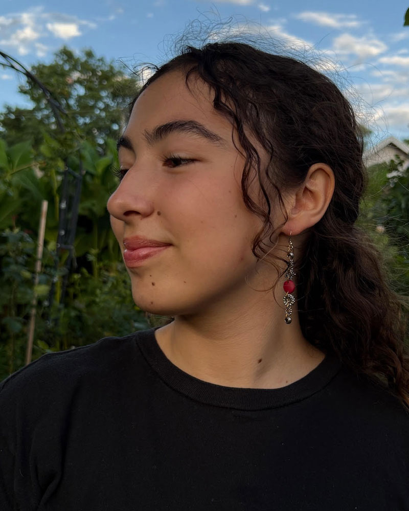
Isabella Alvarez
Continuación
Martin Luther King Jr. Academic Magnet, Nashville, Tennessee, USA
The University of Tennessee Knoxville, Knoxville, Tennessee, USA
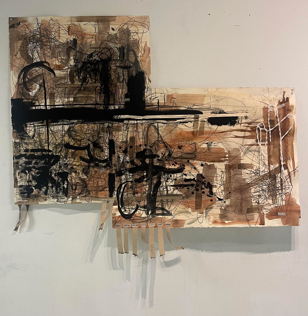
Height: 100”, Width: 150”, Depth: 0.5" | Idea(s): Continuacion is about continuation. Perseverance through the dark to the light. | Material(s): Walnut ink, permanent marker, ultra black acrylic, India ink, marker, yarn, paper towel over paper. | Process(es): The thick, banded, erratic strokes evolve into a discontinued, light, and hopeful clearing. | Curatorial Note: Inventive and expressive mark-making explores dualities such as life and death, dark and light, and hard and soft. The layered composition reveals a strong sense of confidence and discovery, as gestural lines and tonal variation interact with structure and spontaneity. Bold spatial organization and intentional contrast guide the viewer through an emotionally and conceptually charged abstract environment.
STUDENT STATEMENT
Has click para leer la Declaracion de la Estudiante en CASTELLANO
Does your art connect to or take inspiration from any past or present art styles, techniques, or traditions? If yes, how?.
For Continuación, I took inspiration directly from geometric abstraction and studied a restricted color palette.
Which principles of design guided your choices in this artwork, and why?
Motion is an important principle behind Continuación. Bold mark making and parallel/perpendicular lines guide the viewer’s eyes from “light to dark,” an exploration of color and the concept I made the centerpiece of my portfolio. Continuación is engendered through emotional perseverance, as the motion of my line work pushes through the bold busyness of the darker left values to the rightmost aired-out and lighter values. The heavier, more deeply saturated presences dissipate as the viewer’s eyes travel across the work, encouraging motion on your part as you see this piece for the first time.
How did applying design skills (elements and principles) help you strengthen both the look (formal qualities) and the meaning (conceptual direction) of your portfolio?
I have never been formally trained in color theory, but I chose to concern my portfolio with the significance of color and how it impacts the emotional understanding of art. That meant working in grayscale and studying countless color palettes to see how they fit the conceptual direction of each composition. But it also meant introspection on my part, asking myself how I felt or how my work/its process made me feel.
From abstraction to faux-Fauvism, I was enticed by the idea of expressing mundane scenes with vivacious color.
Can you give a specific example of how you revised an artwork to better apply a drawing and/or design skill?
A piece in my portfolio, one of a person picking their nose from a VERY close perspective, was made four times before I found the one I liked enough to call done. Even then, that one wasn’t supposed to be fully finished; I was only halfway through my mental idea of how long that painting’s process was going to be. But this teaches me the lesson of letting go of expectations and unspoken standards I make for myself and my art. Creating with intent holds much more beauty and value than following a standard or a duplicate process. That’s why I had to revise and restart one small piece four times in order to find my full passion in its intent.
Which drawing and/or design skills do you rely on most often in your work, and how do they support your artistic style or message?
Cross-hatching is a heavenly and beautiful skill that I make sure is implemented in even the most organic pieces I make. For my personal art (and even for architecture school) I crosshatch daily—for depth, texture, perspective, shading, everything. I’ve changed my definition of cross-hatching as I’ve grown as an artist, and it encompasses a lot more than the expected. You can find cross-hatching in Continuación, as I create layers of line work in the mid-tones that help the transition of the two stark colors on the left and right.
In what ways did your confidence in art making grow during AP Art and Design?
Decisive mark making and letting go of perfection were the keys to boosting my confidence during this course. This class was so much fun, and being able to have dedicated time to work on my art and practice artistic expression during the school day was wonderful. Building my confidence with color was difficult at first, but the more I allowed myself to fail, learned from my mistakes, and created solutions to challenges, the more I was able to put more meaning and purpose into my work. Basically, the more I mixed colors and threw random values on a plate until I liked how they looked, the more fun I had.
What advice would you share with future AP Art and Design students about building drawing and/or design skills?
I may not have the authority, but I will always encourage everyone to practice drawing constantly. Return to the basics, even if you feel you’ve mastered them. And if you feel stuck, drawing through discomfort is critical to growing as an artist. Remaining stagnant in your comfort zone for too long will hurt your creativity. You must work through the uncertainty to experiment and improve, as difficult as that sounds. Make mistakes and don’t erase them. Time yourself to let go of perfection. Try new things, different mediums and tools. Work both large and small. Create definitions of what you value in art. Also, always remember that creativity is personal and a part of a long personal process. Although comparison may be good for study, obsession over comparing your process to another’s will only hurt your creativity in the end.
Material(s): Process of the prior piece, only walnut ink and permanent marker at this point. | Process(es): Experimenting with markmaking, using everything but my hands to convey the unstable nature of hope
CASTELLANO
¿Qué elementos del arte fueron más importantes en esta obra y cómo los usaste para comunicar tus ideas?
La tinta y la dominancia cruzada fueron vitales para comunicar mi mensaje dentro de este trabajo a través del trazo. Específicamente, la libertad de la tinta sin restricciones y la pérdida de control/expectativa al usar otros métodos de creación de marcas, como mis zapatos. Desconectar mis líneas del perfeccionismo que mis manos me imponían me permitió mostrar la continuidad de la forma a lo largo del lienzo, racimos de caos y manchas saturadas de colores más bien desaturados que reflejan el proceso humano de continuar a través de la caos.
¿Qué principios del diseño guiaron tus decisiones en esta obra y por qué?
El movimiento es un principio importante detrás de Continuación. Las marcas audaces y las líneas paralelas/perpendiculares guían los ojos del espectador de "claro a oscuro", una exploración del color y del concepto que hice el centro de mi portafolio. Continuación se genera a través de la perseverancia emocional, ya que el movimiento de mis líneas atraviesa la ocupada y audaz densidad de los valores más oscuros a la izquierda hasta los valores más aireados y claros a la derecha. Las presencias más pesadas y profundamente saturadas se disipan a medida que los ojos del espectador recorren la obra, fomentando el movimiento por parte del espectador al ver esta pieza por primera vez.
¿De qué manera fue útil emplear habilidades de diseño, tanto elementos como principios, para fortalecer el aspecto visual (las cualidades formales) y el significado (la dirección conceptual) de tu portafolio?
Nunca he recibido formación formal en teoría del color, pero decidí centrar mi portafolio en la importancia del color y cómo impacta en la comprensión emocional del arte. Eso implicó trabajar en escala de grises y estudiar innumerables paletas de colores para ver cómo encajaban en la dirección conceptual de cada composición. Pero también significó introspección de mi parte, preguntándome cómo me sentía, o cómo mi trabajo/su proceso me hacía sentir.
¿Puedes dar un ejemplo específico de cómo revisaste una obra para emplear mejor una habilidad de dibujo y/o diseño?
Una pieza en mi portafolio, una de una persona hurgándose la nariz desde un ángulo MUY cercano, la hice cuatro veces antes de encontrar la que me gustara lo suficiente como para darla por terminada. Incluso entonces, esa no estaba destinada a estar completamente acabada; solo estaba a la mitad de mi idea mental de cuánto iba a durar el proceso de esa pintura. Pero esto me enseña la lección de dejar ir las expectativas y los estándares no dichos que me pongo a mí mismo y a mi arte. Crear con intención tiene mucha más belleza y valor que seguir un estándar o un proceso duplicado. Por eso tuve que revisar y rehacer una pequeña pieza cuatro veces para encontrar toda mi pasión en su intención.
¿Qué habilidades de dibujo y/o diseño utilizas con más frecuencia en tu trabajo y cómo apoyan tu estilo artístico o el mensaje?
El sombreado cruzado es una habilidad celestial y hermosa que me aseguro de implementar incluso en las piezas más orgánicas que creo. Para mi arte personal (e incluso para la escuela de arquitectura) sombreo cruzado a diario; para profundidad, textura, perspectiva, sombreado, todo. He cambiado mi definición de sombreado cruzado a medida que he crecido como artista, y abarca mucho más de lo esperado. Se puede encontrar sombreado cruzado en Continuación, ya que creo capas de lineado en los tonos medios que ayudan a la transición de los dos colores contrastantes a la izquierda y derecha.
¿De qué maneras creció tu confianza en la creación artística durante AP Art and Design?
Hacer marcas decisivas y dejar de lado la perfección fueron las claves para aumentar mi confianza durante este curso. Esta clase fue muy divertida, y poder tener tiempo dedicado a trabajar en mi arte y practicar la expresión artística durante el horario escolar fue maravilloso. Construir mi confianza con el color fue difícil al principio, pero cuanto más me permitía fallar, aprender de mis errores y crear soluciones a los desafíos, más podía poner significado y propósito en mi trabajo. Básicamente, cuanto más mezclaba colores y lanzaba valores al azar en un plato hasta que me gustaba cómo se veían, más diversión tenía.
¿Qué consejos compartirías con futuros estudiantes de AP Art and Design sobre el desarrollo de habilidades de dibujo y/o diseño?
Puede que no tenga la autoridad, pero siempre animaré a todos a practicar el dibujo constantemente. Vuelvan a lo básico, aunque sientan que ya lo han dominado. Y si se sienten bloqueados, dibujar a pesar de la incomodidad es fundamental para crecer como artista. Permanecer demasiado tiempo en su zona de confort perjudicará su creatividad. Deben trabajar a través de la incertidumbre para experimentar y mejorar, por difícil que parezca. Cometan errores y no los borren. Crónometrense para dejar de lado la perfección. Intenten cosas nuevas, diferentes medios y herramientas. Trabajen tanto a gran como a pequeña escala. Definan lo que valoran en el arte. Además, recuerden siempre que la creatividad es personal y parte de un proceso largo y personal. Aunque compararse puede ser útil para aprender, obsesionarse con comparar su proceso con el de otro solo dañará su creatividad al final.
TEACHER STATEMENT
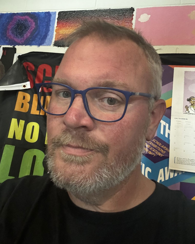
Joseph Graham
Visual Arts Educator
Martin Luther King Jr. Academic Magnet
How often did your class meet?
My classes meet for 50 minutes, 3 days a week, or 1.5 hours once a week.
Is AP Art and Design taught at your school as a separate course, or is it combined with other art classes? Please describe the structure of your AP Art and Design course.
Isabella’s work was done at Governor’s School over the summer. (She had established her question the year before in Art 3). At my school, AP is mixed within other art classes.
How did you guide students in developing and refining their inquiry statements and portfolio direction during their Sustained Investigations?
Students were encouraged to make mistakes, push boundaries, and THINK. Fear of failure begins to dissolve, and students begin to thrive in their making.
How did you help students strengthen technical skills and apply design knowledge (elements and principles) while also developing creative problem-solving habits?
Students were shown portfolios from previous years, and we critiqued them without knowing the artist’s question. They only assessed the design elements and mark making.
In what ways did you structure opportunities for practice, experimentation, and revision into your curriculum?
My room was available anytime during the day for AP students to work on their investigations. We utilized every inch of space!
How did you manage classroom resources and materials to support art making?
Students were encouraged to forage materials that interacted with their question.
In what ways did you integrate digital tools or technology into students’ creative processes?
Procreate was used to refine ideas, experiment, and lay out “How, Why” pages
What advice would you offer to other AP Art and Design teachers?
Stay out of their way. Don’t tell them no—ask them how or why.
PRINCIPAL STATEMENT
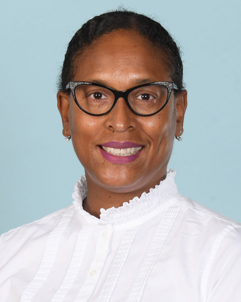
Dr. Angela McShephard-Ray
Visual Arts Educator
Martin Luther King Jr. Academic Magnet

What makes you most proud of your school’s AP Art and Design program and its impact on your students and teacher(s)?
Mr. Graham is not only a practicing artist—he also brings his creativity into his AP Art classroom, where he teaches all of the AP Art classes we offer. Mr. Graham supports the students that enter with different art ability levels and sees the artist grow in each student as they progress in our AP Art program. No matter if the student becomes an acclaimed artist or makes the needed progress, Mr. Graham works to ensure all AP Art students have a place and his support in his classroom. Everyone has a special place in Mr. Graham’s AP Art classes!
What actions or priorities have you implemented to strengthen visual arts programming at your school?
In order to strengthen the visual arts programming at Martin Luther King Jr. Magnet High School, I have worked with the art teachers to create spaces for our student work to be placed for our entire school community to see and celebrate. I also support our annual short film festival, where we see a different form of our students’ artwork viewed and celebrated. In addition, each year an AP Art student creates our annual Thanksgiving postcard and winter holiday card that is given to the faculty during the respective seasons. The community looks forward to receiving these cards and celebrating the student artists. I also share opportunities where student artwork can be showcased outside of our school community, where they can be celebrated.
What advice would you share with other school leaders about building and sustaining strong AP Art and Design programs?
You have to get the right teacher in the right seat in order to have and help develop a great AP Art and Design program. When this is done, these teachers will be like magnets, attracting students to their passion and helping students to develop their passion in your AP Art and Design program.

Isabella Alvarez